Supplier issues
discovered almost too late.
The problem is the agony, the fear of not knowing whether the supplier will arrive on time with the necessary products and whether they match what was ordered. At that moment, service is already at risk. There is very little time left to react.
Deep Qualitative
Research
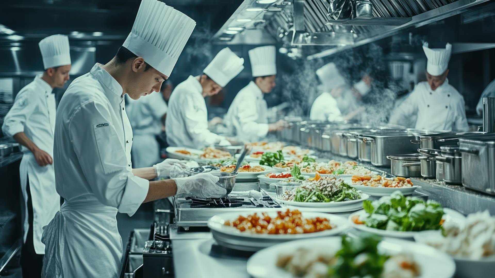
10 Top Executive Chefs with +10 years experience and biggest Fruit & Vegetable suppliers in Switzerland
Chefs from Germany, Uruguay, France, Switzerland and Spain
of the chefs surveyed are directly affected by late deliveries
"An early warning system for delays or supplier problems would be a good solution to this problem, as it would allow us to respond sooner and salvage the service."
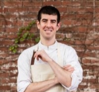 Daniel Garcia Serra · Executive Chef at the Yellowstone Club, Big Sky, Montana, United States
"Then you often have to run around to make sure they deliver the product on time and in good condition, or you have to work with other suppliers, but it's always a headache when that happens to you."
 Marco Silva Lindblom · Executive Chef at the England Embassy, Montevideo, Uruguay
"If the product doesn't meet the required standard, I immediately feel frustrated and concerned about the operational side of things. As a chef, I am responsible for the final quality."
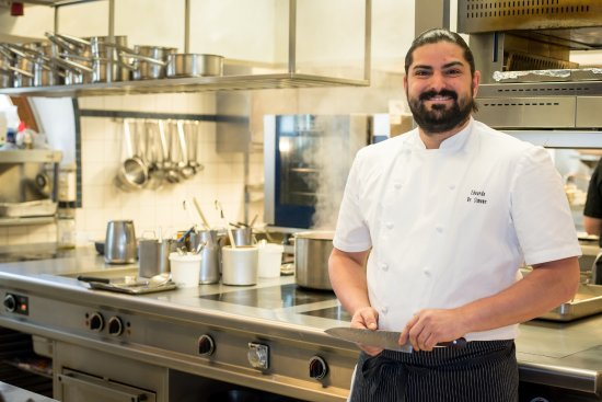 Edoardo De Simone · Executive Chef at Clinique La Prairie, Clarens, Suisse
The key
design question.
The user persona and the ten interviews converged into a single question. This became the filter for every product and design decision that followed.
How might we help chefs in gastronomy detect supply disruptions early so they can react before service is affected?
Three decisions that
shaped the product
The interviews became the foundation for every product decision. Hearing the same operational tensions across multiple kitchens helped separate assumptions from real workflow problems.
Validated
user research
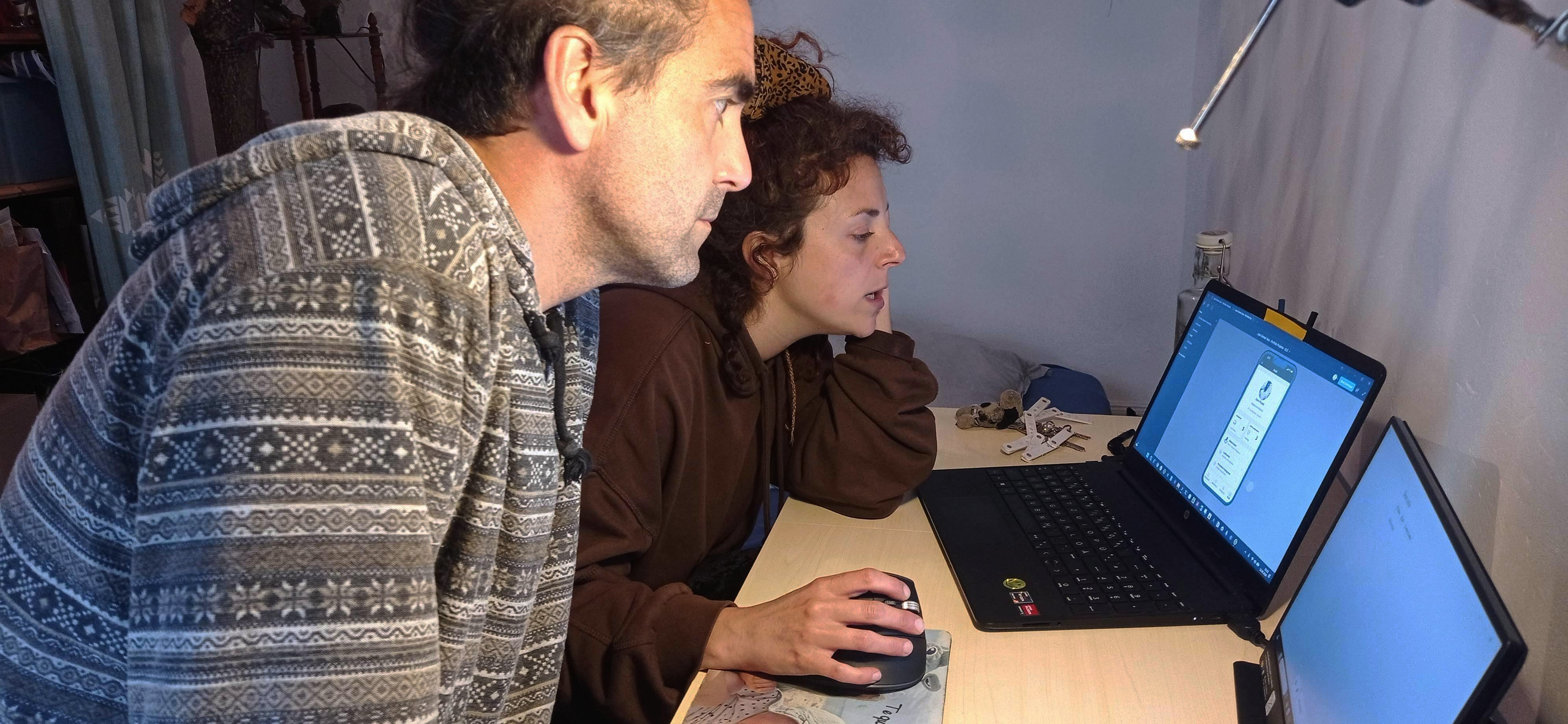
From generic labels
to clear language
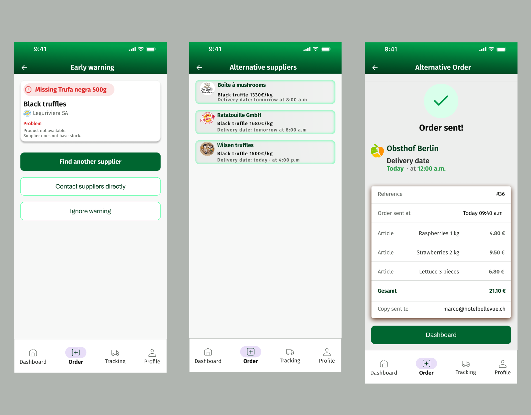
Before: first usability test
Before the test
- Generic status terms: ambiguous labels that created hesitation at decision points
- Inconsistent labels: the same action named differently across screens
- Unclear CTAs: testers could not determine the consequence of an action before taking it
- Flat visual hierarchy: primary and secondary actions carried equal visual weight
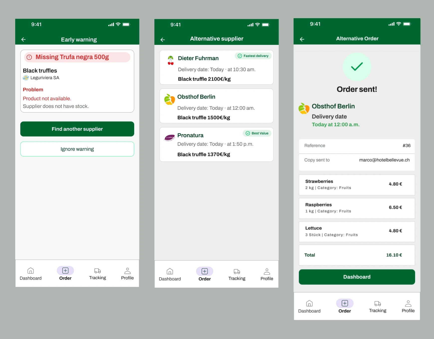
After: revised interface
After the iteration
- Clear status badges: each state communicates exactly what it means with no interpretation needed
- Unambiguous action labels: consistent terminology across every screen and state
- Visible hierarchy: primary actions are visually dominant, secondary actions recede
- Scannable language: every label written for a chef with three seconds and high stress
Three screens.
One clear flow.
Supply Pro focuses on a single operational moment: the gap between placing an order and receiving a delivery. From the first tap to a confirmed decision in under three minutes. Supply Pro is designed for shared kitchen use. While fully responsive, the iPad is the primary device, always accessible, always visible to the whole team.
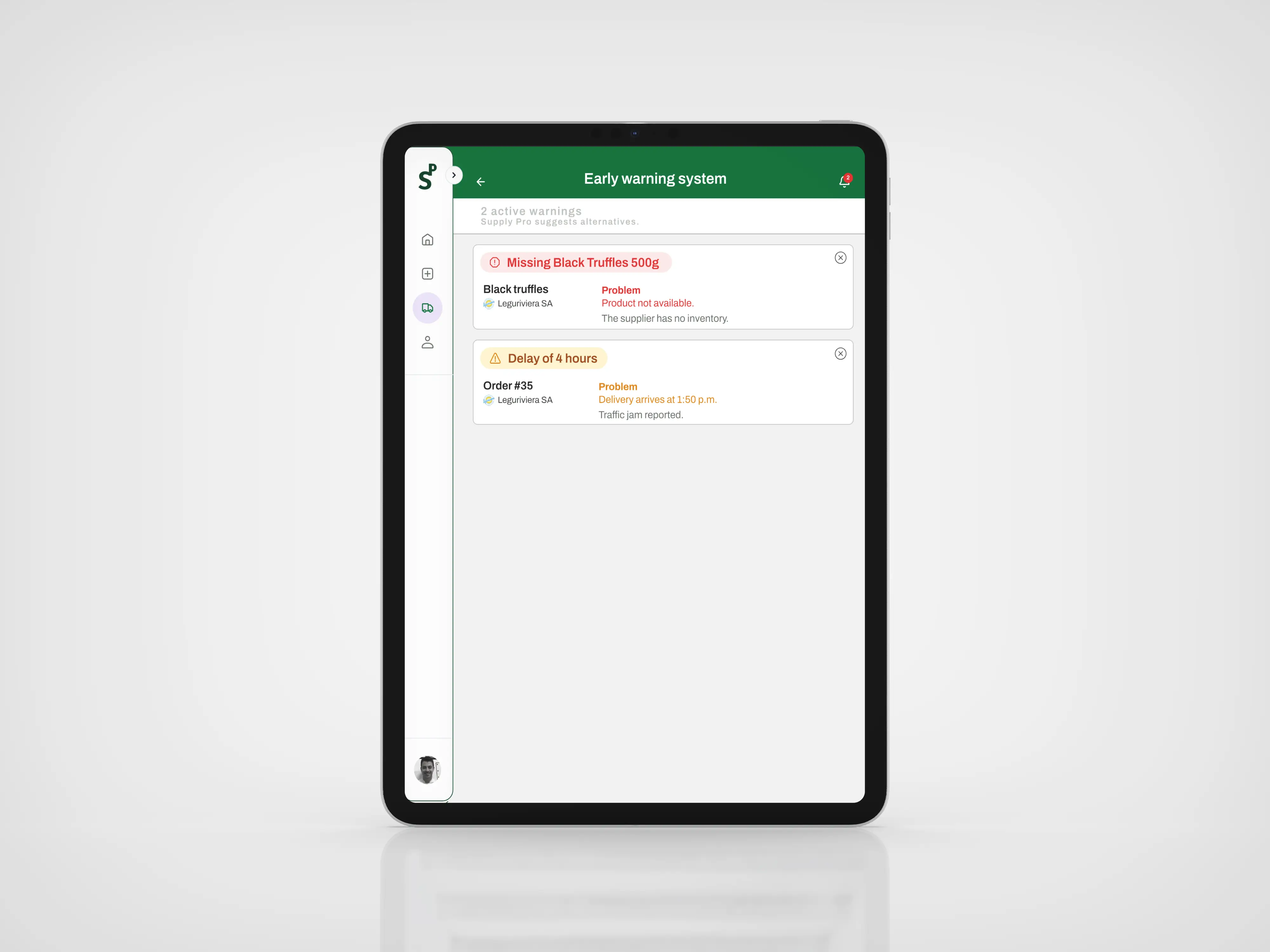
The Early Warning Screen uses a table layout designed for high-pressure kitchen environments. Critical information is easy and fast to scan. The status badge system communicates urgency at a glance. The chef reviews the alert and makes one decision: accept a suggested alternative or dismiss it.
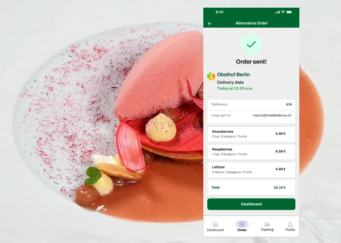
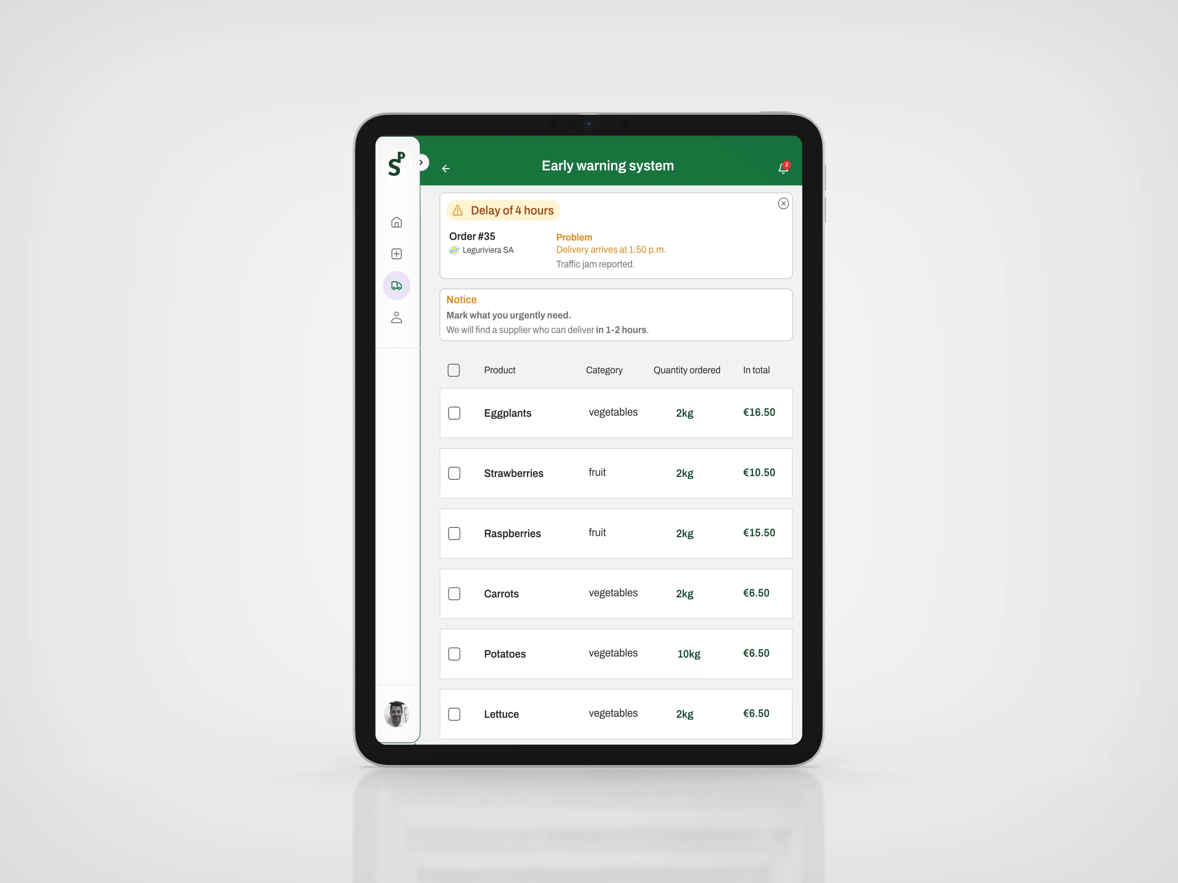
When a supplier is unavailable, the system automatically suggests products from an alternative supplier. The chef selects only what is urgently needed. Alternatives are organized alphabetically to reduce search time in a high-pressure environment. Checkboxes allow quick selection of one or multiple products without switching screens. Price, delivery time, and availability are provided by the alternative supplier.
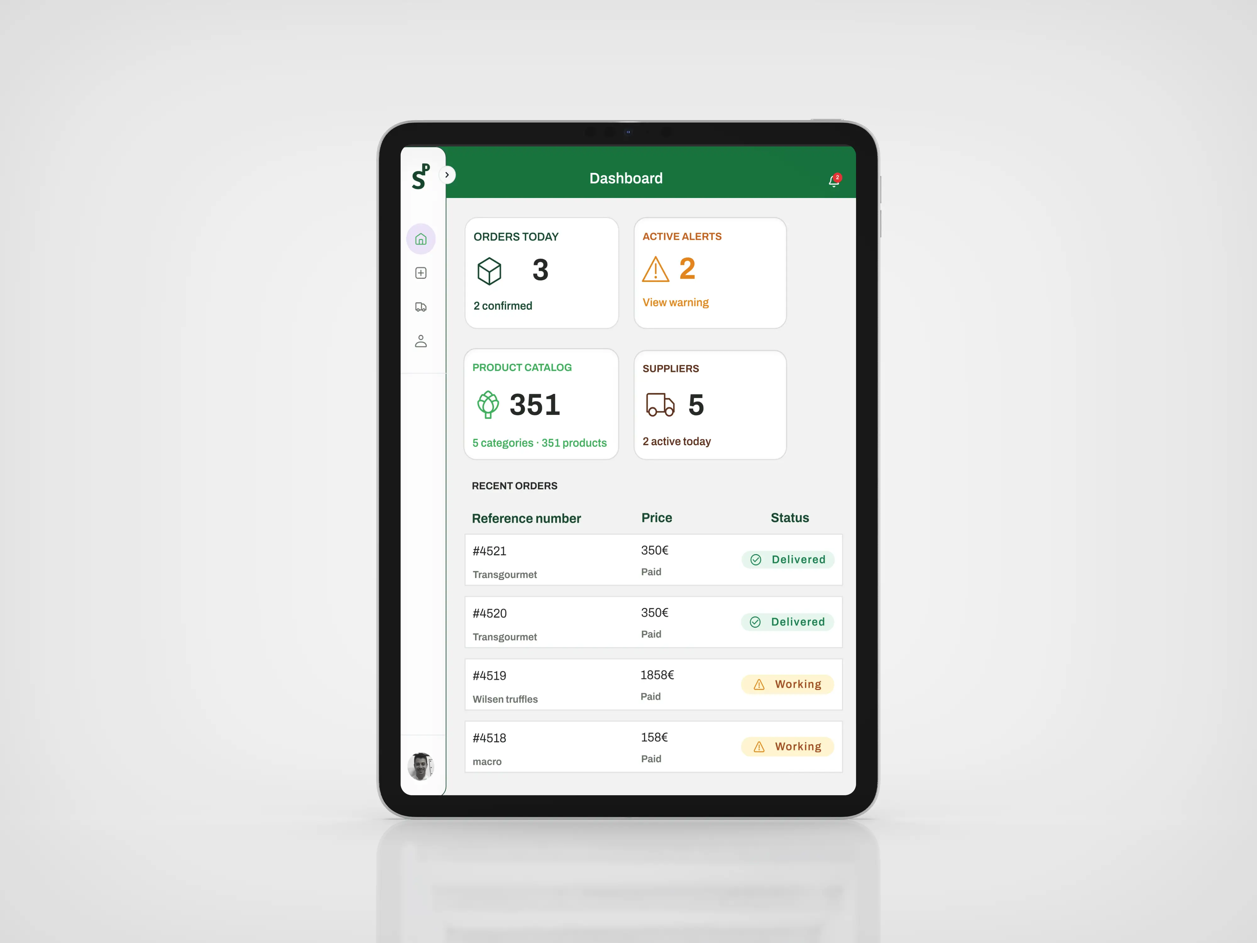
The dashboard gives the chef a complete picture of daily supply operations in one view. Four summary cards surface the most critical numbers instantly. Active alerts are positioned top right in orange to ensure urgency is never missed. Below, the Recent Orders table uses the same status badge system as the Early Warning Screen, creating visual consistency across the product.
See it in
motion.
One tool per
phase of the process
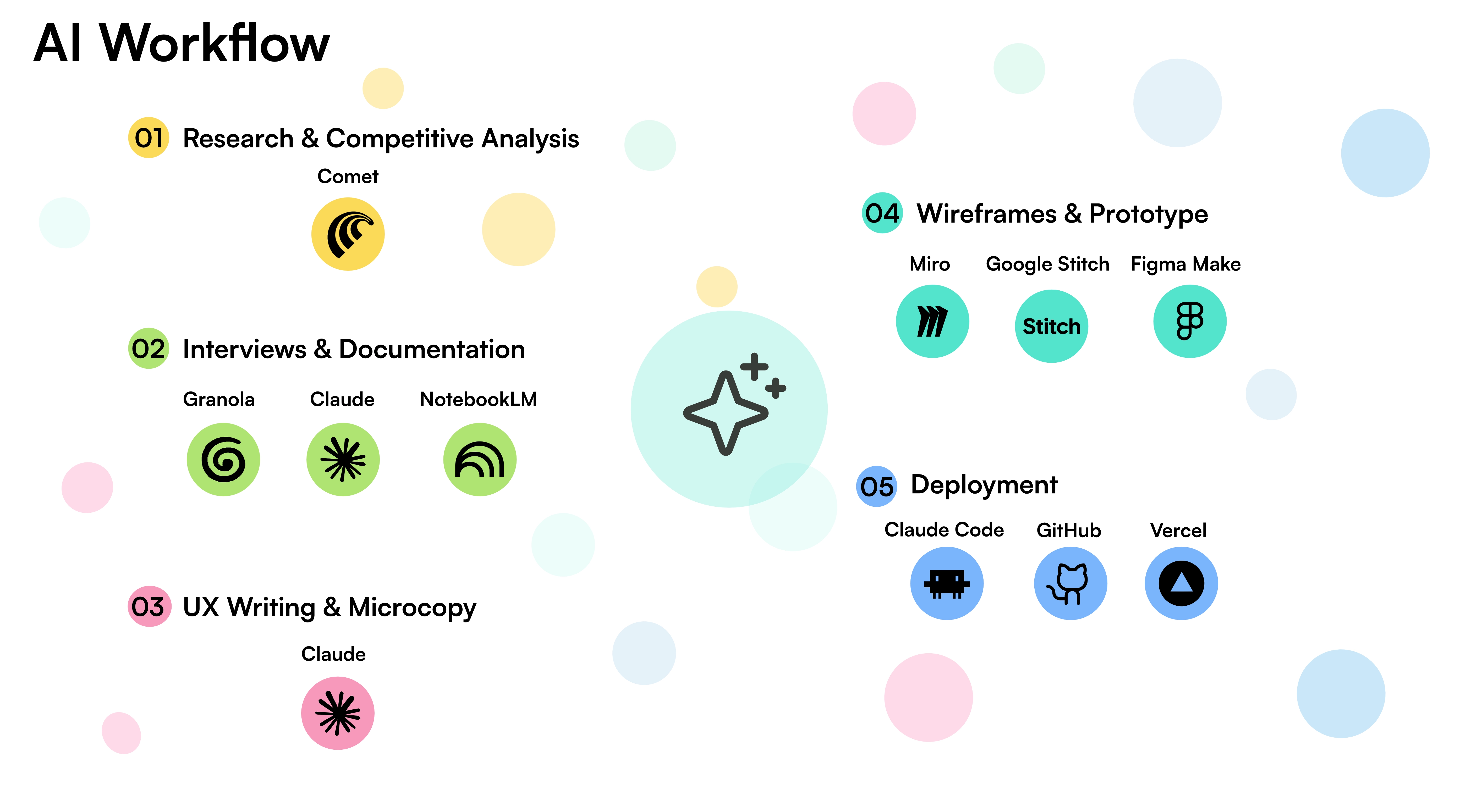
AI was not a single tool. It was a system of specialized tools, one matched to each phase of the Design Thinking process.
Measuring what
actually matters
These indicators validate that Supply Pro is solving the right problem, and demonstrate how quickly it is doing so.
The next three
versions
The long-term goal: Supply Pro becomes the operational memory of a professional kitchen.
What this project
taught me
"Even though it was in another language, you could still figure out what to do. In fact, it's super clear, it's not at all hard to understand how it works. There's nothing superfluous; it simply provides the necessary information."
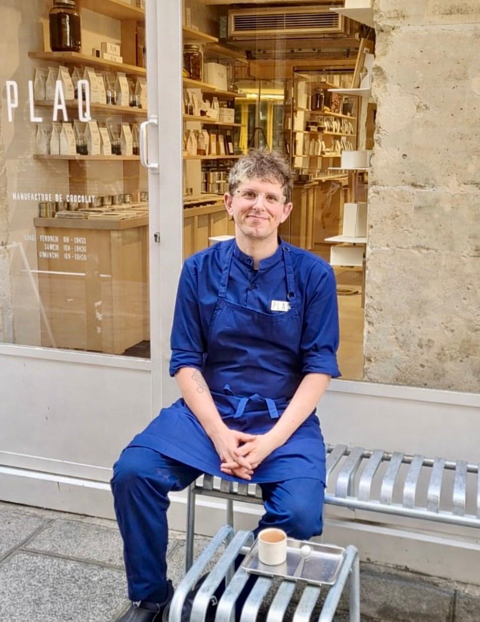 Valentin Chappuis · Pastry Chef, Vegan Restaurant Aujourd'hui Demain, Paris, France